Responsive Button Design Tool: A Complete Guide
Creating aesthetically pleasing, functional, and responsive designs is critical in the fast-paced digital world. Buttons are integral to user interaction for navigation, form submission, or action triggers. A responsive button design tool empowers designers and developers to craft buttons that look great and function seamlessly across devices.

Why This Topic Matters
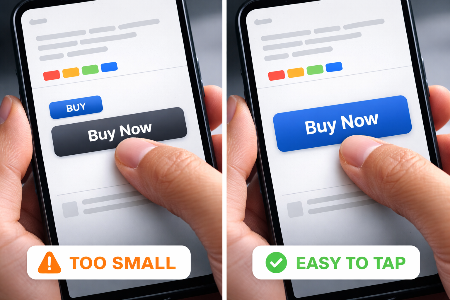
This article explores what makes a responsive button design tool valuable, its features, and how to use it to elevate your web projects. In modern UI, buttons are your “action point.” If they’re too small on mobile, misaligned at certain widths, or missing focus styles, users feel friction immediately.
What Is a Responsive Button Design Tool?
A responsive button design tool is a specialized application or software feature that allows designers and developers to create buttons that adapt seamlessly across different screen sizes, devices, and user interactions. These tools are integral to modern web and app design, ensuring buttons remain functional, visually appealing, and user-friendly in various contexts.
Why Are Responsive Buttons Important?
In the digital age, users access websites and applications from many devices, from desktop computers and laptops to tablets and smartphones. Buttons not designed to be responsive can break layouts, hinder navigation, and create a poor user experience. A responsive button adjusts to:
- Screen Sizes: Remains appropriately sized and positioned, whether viewed on a smartphone, tablet, or desktop.
- User Inputs: Adapts to different input methods, such as touch, mouse clicks, or keyboard navigation.
- Accessibility Needs: Supports usable, inclusive designs for a wider range of users.
Key Features of Responsive Button Design Tools
Good tools help you define styling rules once and keep your button system consistent everywhere.
Customizable Dimensions
Automatically adjust button size based on screen dimensions and layout context.
Interactive States
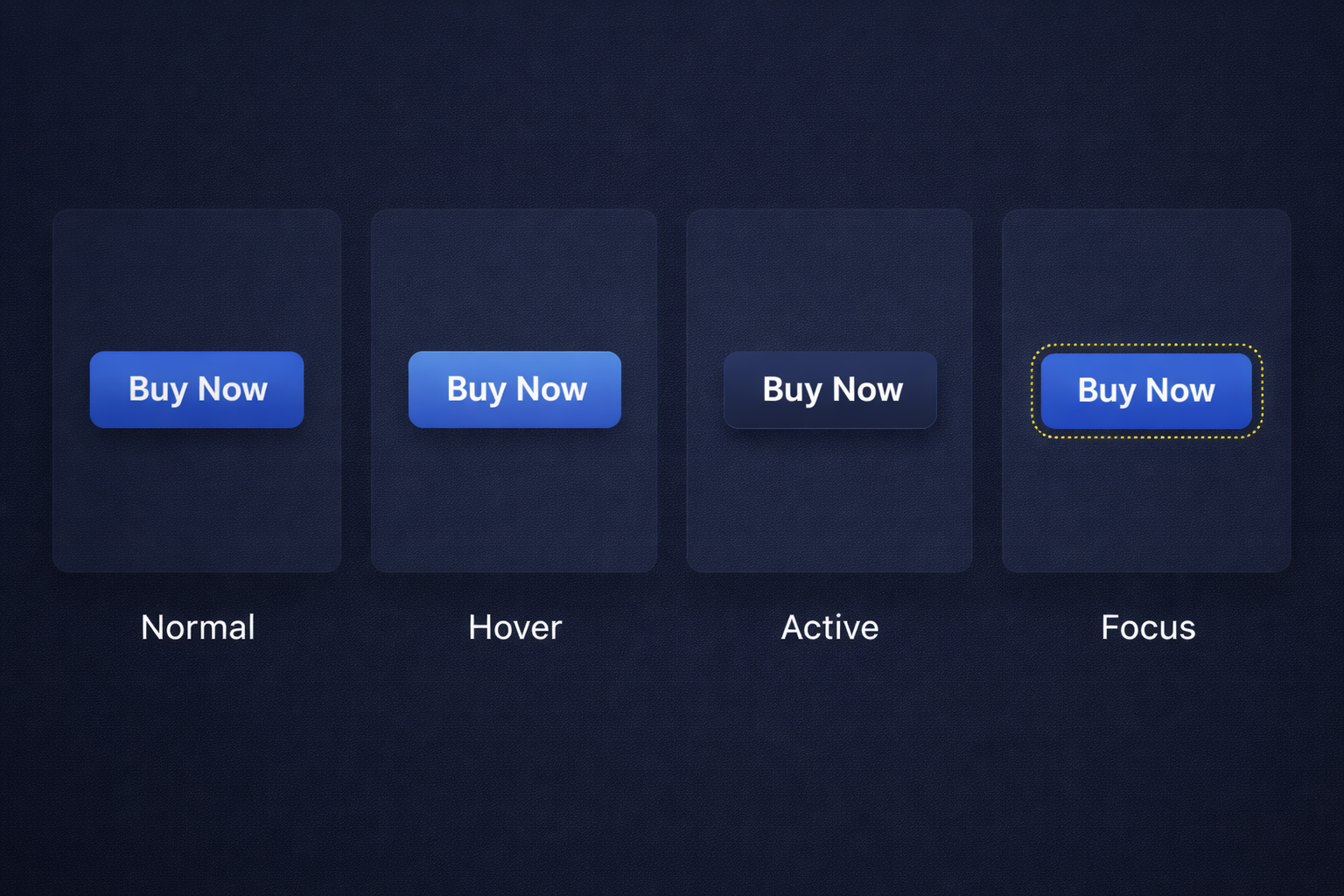
Include hover, active, and focus states to enhance user interaction.
Flexibility
Allow integration with CSS frameworks or libraries like Bootstrap, Tailwind, or Material Design.
Testing Capabilities
Provide real-time previews to test button responsiveness across multiple devices.
Code Export
Generate clean, reusable HTML/CSS or JavaScript code for seamless development.
Drag-and-Drop Interface
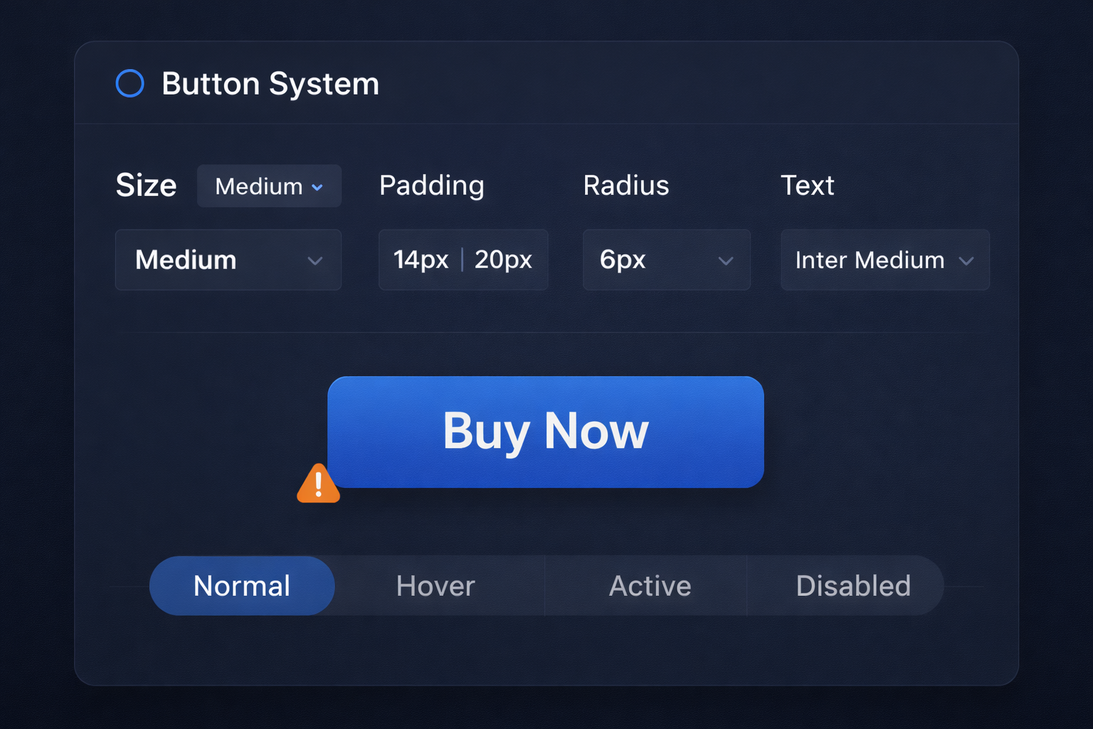
A user-friendly interface allows you to design buttons by dragging and dropping components. You can adjust size, color, font, and shadows without extensive coding knowledge.
Device Previews
Preview how your button looks and behaves on various devices.
Customizable Properties
- Color Palettes: Choose from predefined palettes or create your own.
- Typography: Select fonts, sizes, and alignments.
- Shapes: Rounded corners, sharp edges, or custom shapes.
State Management
Design for multiple states, including:
- Normal: Default state.
- Hover: Highlighted on mouseover.
- Active: When clicked.
- Disabled: Inactive or unavailable.
Responsive Breakpoints
Set breakpoints to define button behavior and appearance for different screen widths, ensuring optimal usability.
Animations and Transitions
Add subtle animations like fades, zooms, or slides for an engaging user experience.
Popular Responsive Button Design Tools
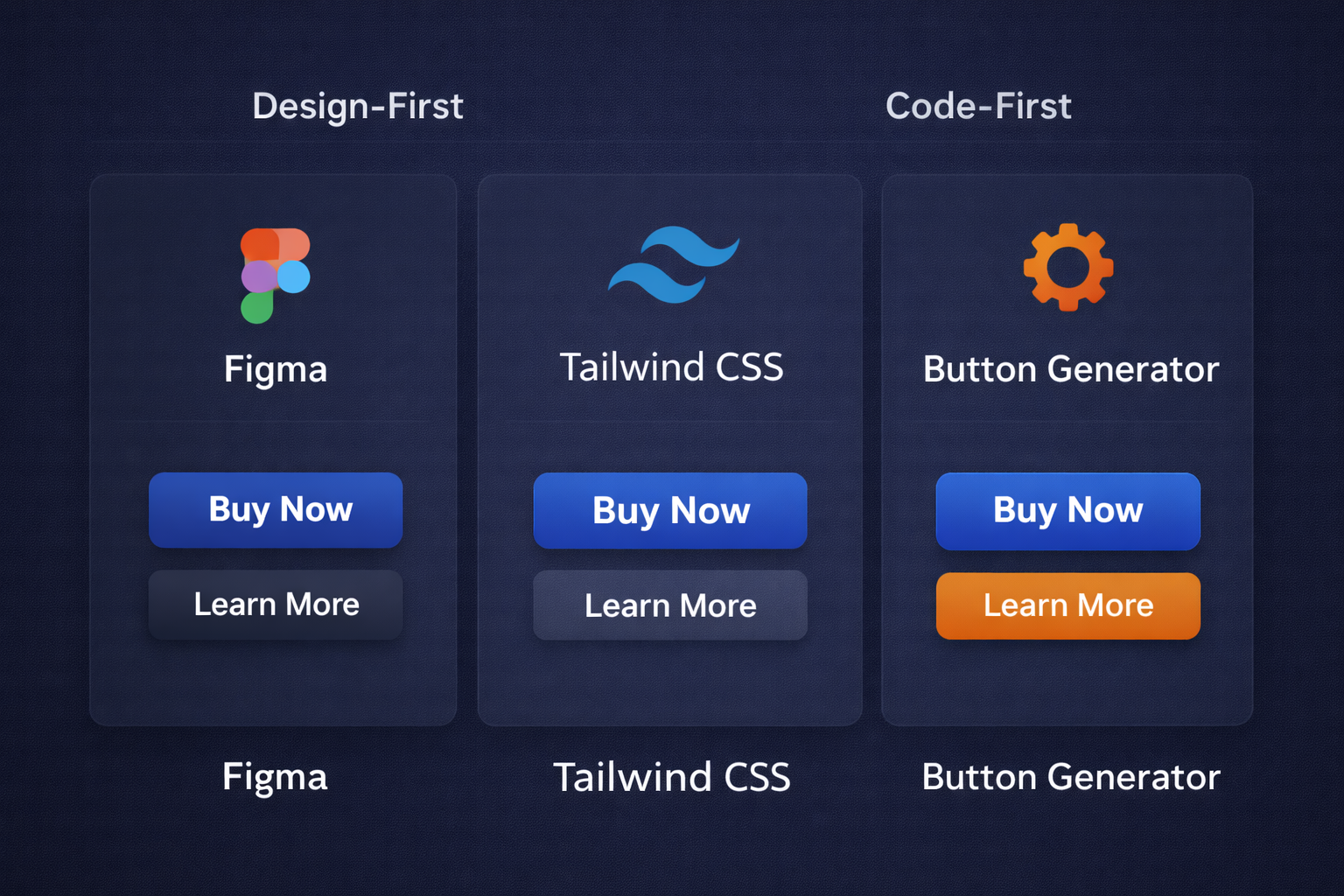
| Tool | Features | Best For |
|---|---|---|
| Figma | Collaborative design, prototyping, and plugin integration. | Designers and teams |
| Adobe XD | Seamless UI/UX design with animation tools and asset libraries. | Advanced interactive designs |
| CSS Button Generator | Quick CSS-only button creation with customizable styles. | Beginners and quick projects |
| Tailwind CSS | Utility-first framework for designing custom buttons with responsive classes. | Developers and coders |
| Button Builder | Drag-and-drop button generator with code export. | Non-coders and small projects |
Benefits of Using a Responsive Button Design Tool
Efficiency
A responsive button design tool can dramatically improve workflow efficiency by automating repetitive tasks. Instead of manually writing complex media queries or adjusting button styles for each screen size, the tool handles adjustments automatically. As a result, the overall design process becomes faster and more streamlined.
Consistency
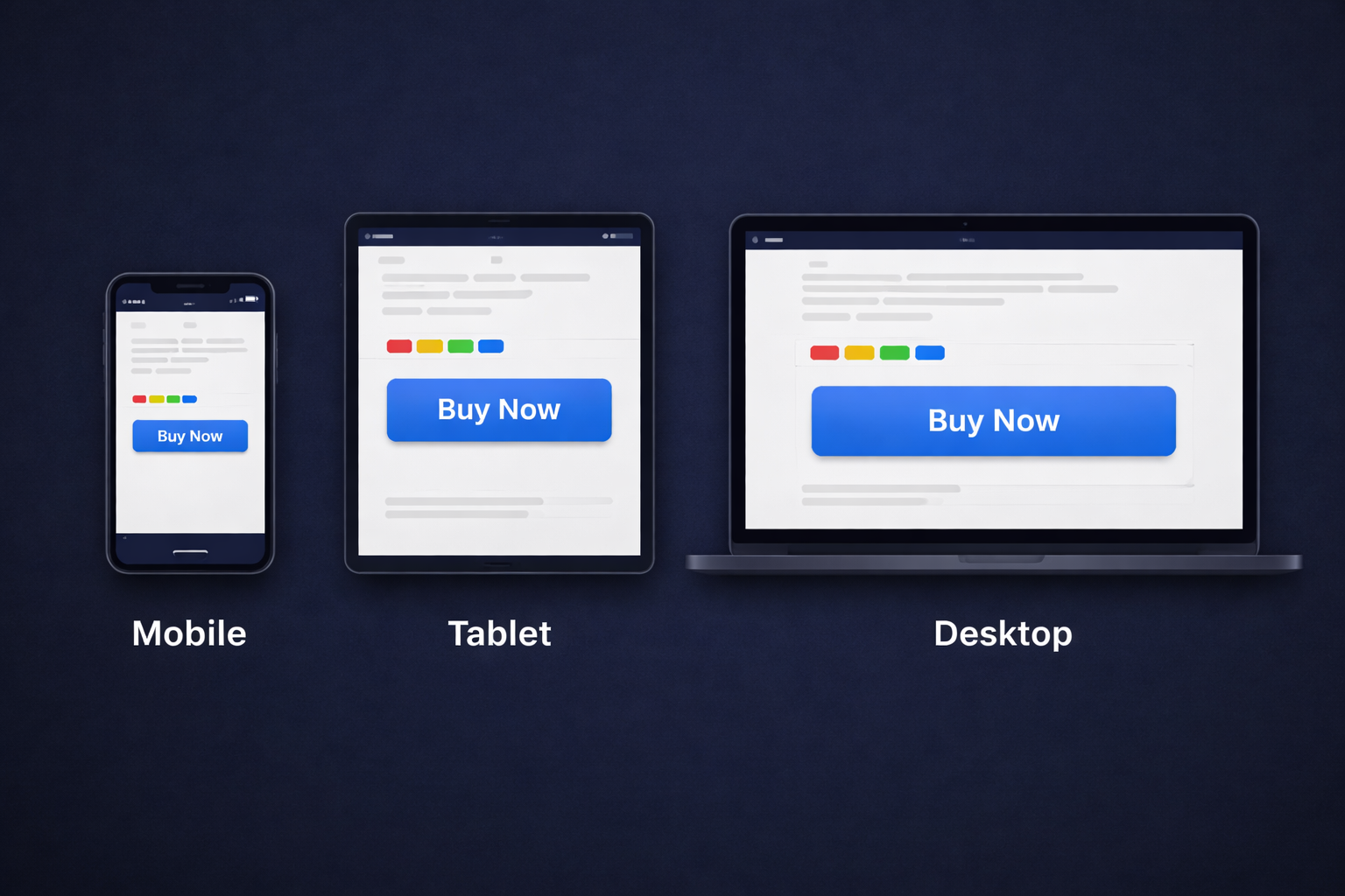
One significant advantage is consistency across devices and platforms. These tools help buttons display uniformly on desktops, tablets, and mobile devices. Standardizing button sizes, spacing, and alignment fosters a seamless user experience.
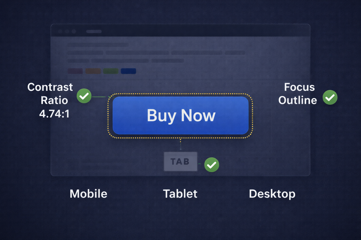
Accessibility
Accessibility is a key component of modern web design. A responsive button design tool can help you incorporate:
- Proper contrast ratios: Improves readability for users with visual impairments.
- Keyboard navigability: Helps users interact without a mouse.
- ARIA-label support: Improves screen reader clarity and site inclusivity.
Scalability
As your project grows, scalability matters. A responsive button design tool makes it easier to adapt and update designs to accommodate new features, devices, or trends. Modify the system in one place and propagate changes across your UI.
Quick Tip: Track Which Buttons Get Clicked
If your buttons drive signups, downloads, or affiliate clicks, tracking matters. These tools help you create clean links, manage URLs, and see what actually gets clicked.
Affiliate disclosure: Some links may be affiliate links. If you purchase, we may earn a commission at no extra cost to you.
Steps to Design a Responsive Button
Define the Purpose
Decide what action you want the user to take. It might be a call-to-action like “Buy Now,” “Subscribe,” or “Learn More,” or a functional button such as “Submit,” “Save,” or “Reset.” Purpose influences size, placement, and urgency.
Choose the Tool
Select a tool that fits your project needs and skill level. Options range from drag-and-drop editors to advanced platforms with deep CSS control. Ensure it supports responsive behavior across devices.
Customize Design
- Color: Align with your brand and keep contrast readable.
- Size: Big enough to tap/click without overwhelming the layout.
- Typography: Legible font and sizing on desktop and mobile.
- Shape: Rounded or sharp corners that fit your design language.
Add Interactivity
Configure hover, active, and focus states. Hover indicates clickability, active gives feedback when pressed, and focus supports keyboard users.
Test Responsiveness
Use previews to test button behavior on smartphones, tablets, and desktops. Confirm sizing, alignment, and text readability at multiple widths. Real device testing catches issues emulators miss.
Export Code
Export clean, ready-to-use HTML/CSS. Review output for performance and remove unnecessary markup before integrating into your project.
Tips for Effective Button Design
Keep It Simple
Simple buttons communicate purpose faster. Avoid unnecessary decoration that makes buttons harder to scan or read.
Focus on Contrast
Contrast makes buttons easy to find and easy to read. Ensure the label stands out clearly from the background.
Use Descriptive Labels
Prefer “Submit,” “Learn More,” or “Add to Cart” instead of “Click Here.” Clear labels reduce uncertainty and boost action.
Prioritize Accessibility
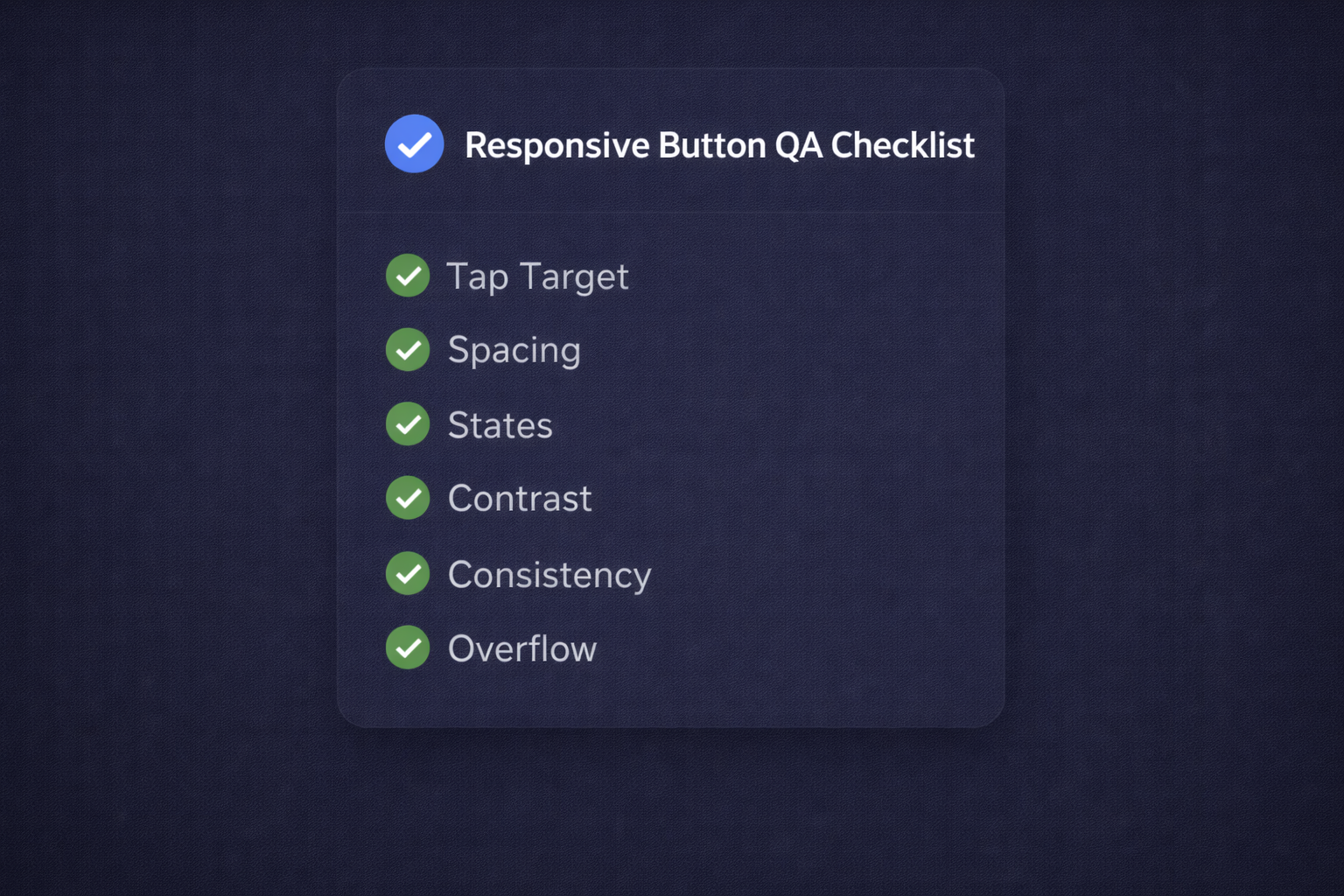
- Larger touch targets: Reduces mis-taps on mobile.
- Alternative text for icons: Helps screen readers interpret the action.
- Keyboard navigability: Ensures users can interact without a mouse.
Test on Real Devices
Emulators help, but real testing on phones and tablets reveals usability issues faster—especially around tap targets and thumb reach.
FAQ
What makes a button responsive?
A responsive button scales and reflows cleanly across screen sizes, stays tappable on mobile, and keeps readable text with consistent spacing and states.
Do I need a tool if I already use a CSS framework?
Not always. Frameworks help you implement consistently. Tools help you prototype and validate faster. Many teams use both.
What accessibility features matter most for buttons?
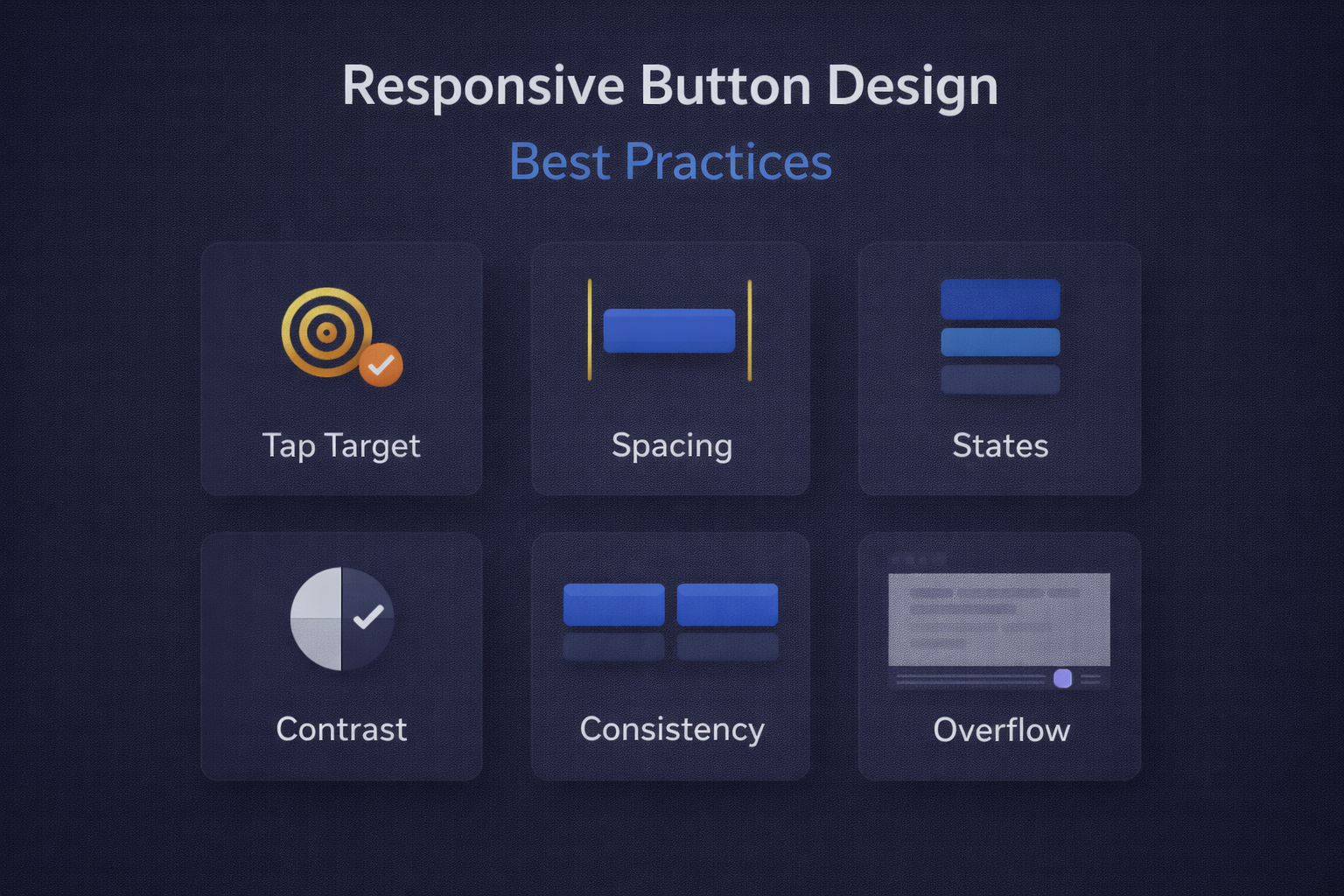
Visible focus states, readable contrast, and sufficient tap targets matter most. Clear labels and keyboard support are also important.
How do I keep button styles consistent across a site?
Define a small set of button variants (primary/secondary/ghost) with shared sizing rules and reuse them everywhere instead of styling ad hoc.
Conclusion
Responsive button design tools simplify the creation of visually appealing and functional buttons across devices. You can save time, maintain consistency, and improve accessibility by using a repeatable system.
Whether you’re a seasoned developer or a beginner, integrating a responsive button design tool into your workflow is a smart move for modern web design.
I’ll be thinking about these points for a while.