Learn how to use CSS border corners to instantly upgrade your site’s design, increase user engagement, and boost your conversions. No coding degree needed—just this simple guide.
Stop Losing Clicks Over Something This Small…
You’ve spent hours tweaking your landing page, optimizing your buttons, writing magnetic headlines…
But something still looks off.
Your page feels rigid, boxy, and kinda… 2008?
 That’s where border corners come in.
They might sound boring. But when used right, they add that soft, polished, modern feel your visitors subconsciously trust. And trust leads to action—clicks, leads, and sales.
Let me break it down…
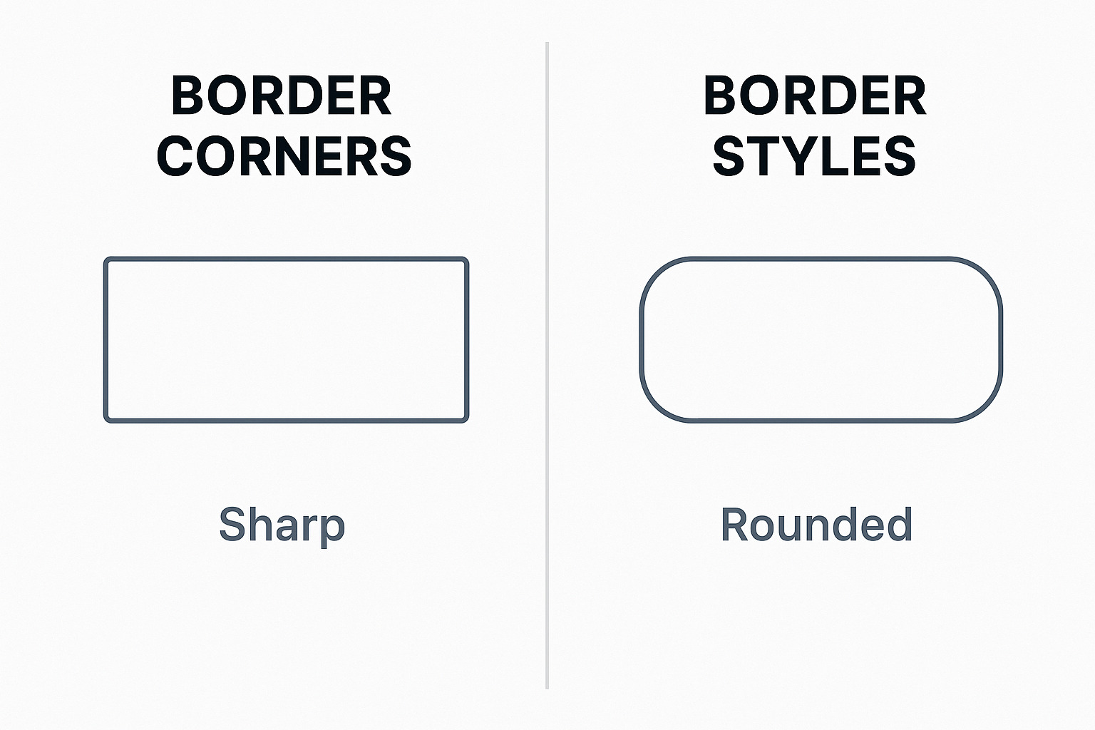
What Are Border Corners?
In simple terms: border corners = rounded corners on elements like boxes, buttons, and images.
In CSS, it’s controlled with one little property:
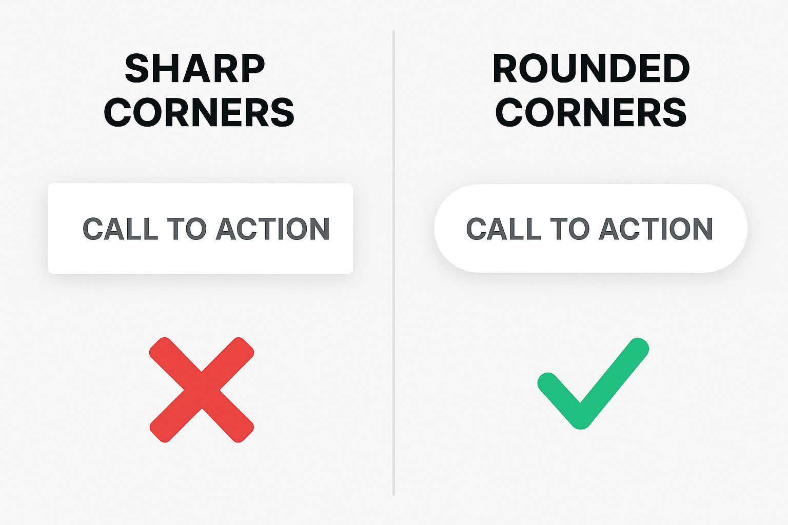
You’ve probably seen this in action on buttons: Rounded button = sleek, clickable
 Sharp-edged button = outdated, ignored
But it’s not just buttons. You can add border-radius to:
Contact forms
Content boxes
Testimonials
Product cards
Images
CTA banners
The result? Everything feels smoother, easier to look at, and more premium.
Quick Example: Code Snippet
Here’s how dead-simple it is:
That’s it. Just one line of CSS and your boring rectangle becomes a sleek, conversion-friendly container.
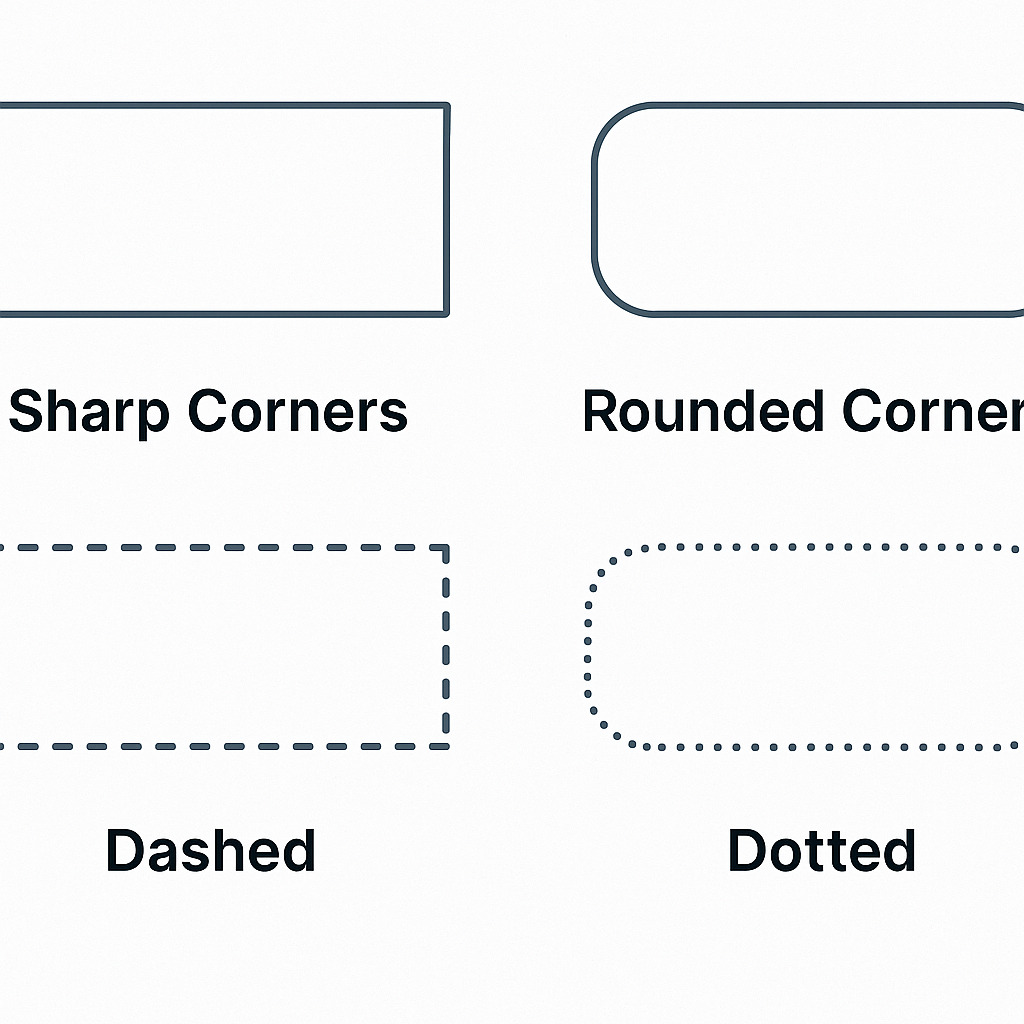
Want a pill-style button?
Want only top-left and bottom-right corners rounded?
Boom. Custom shape. Custom feel.
Why Border Corners Actually Matter for Your Business
Let’s get real. You’re not here to be a pixel-pushing perfectionist.
You’re here to make money.
So here’s how rounded corners help with that:
 1. They Trigger Trust
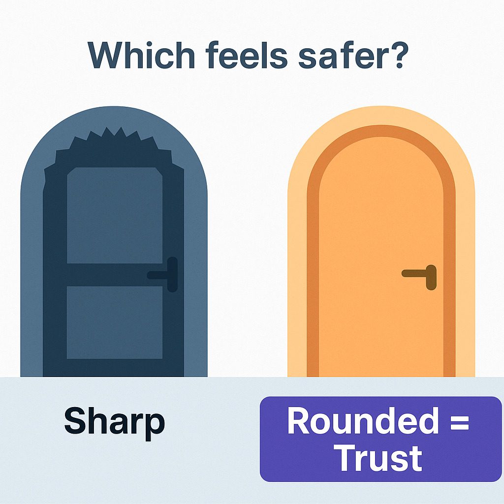
Studies show users associate rounded shapes with safety and friendliness.
Your visitors won’t say, “Oh nice border-radius!”
But they will feel less resistance to clicking.
 2. They Make CTAs Pop
A soft edge on a bold color grabs attention—without screaming.
 3. They’re Mobile-Friendly
Sharp boxes look crowded on small screens. Rounded ones feel breathable and clean.
 4. They Increase Perceived Value
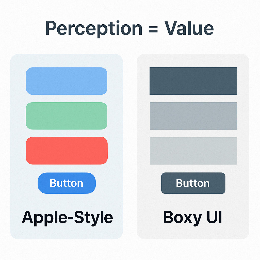
Smooth design = high-end perception = more trust = higher conversions.
This isn’t fluff. Even Amazon and Apple lean into soft UI.
Real-Life Use Case (Affiliate Marketing Edition)
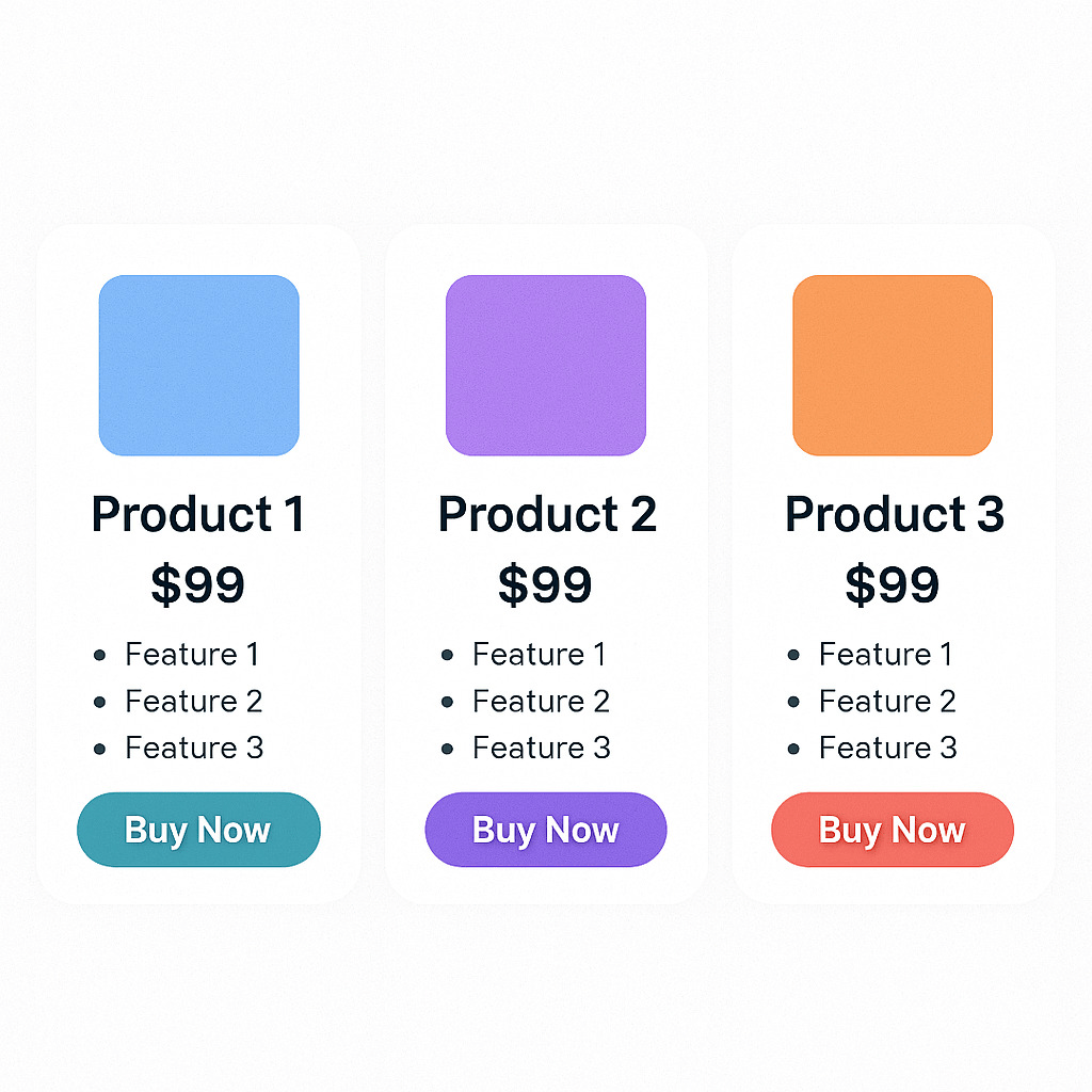
Let’s say you’re promoting a high-ticket ClickBank offer. You make a comparison chart between 3 products.
Add border-radius:
Each product gets a rounded card
Images stand out
Buttons are eye-catching
 Result: Looks pro. Feels modern. Converts better.
And here’s the kicker—you don’t need a designer. You don’t need a dev. You just need the right CSS border-corner trick.
Pro Tip: Combine Border Radius with Shadows
Want to add depth and dimension to your layout?
Try this:
This one-two punch makes any section stand out like it was built by a $10k designer.
Tools to Help You Generate Rounded Corners
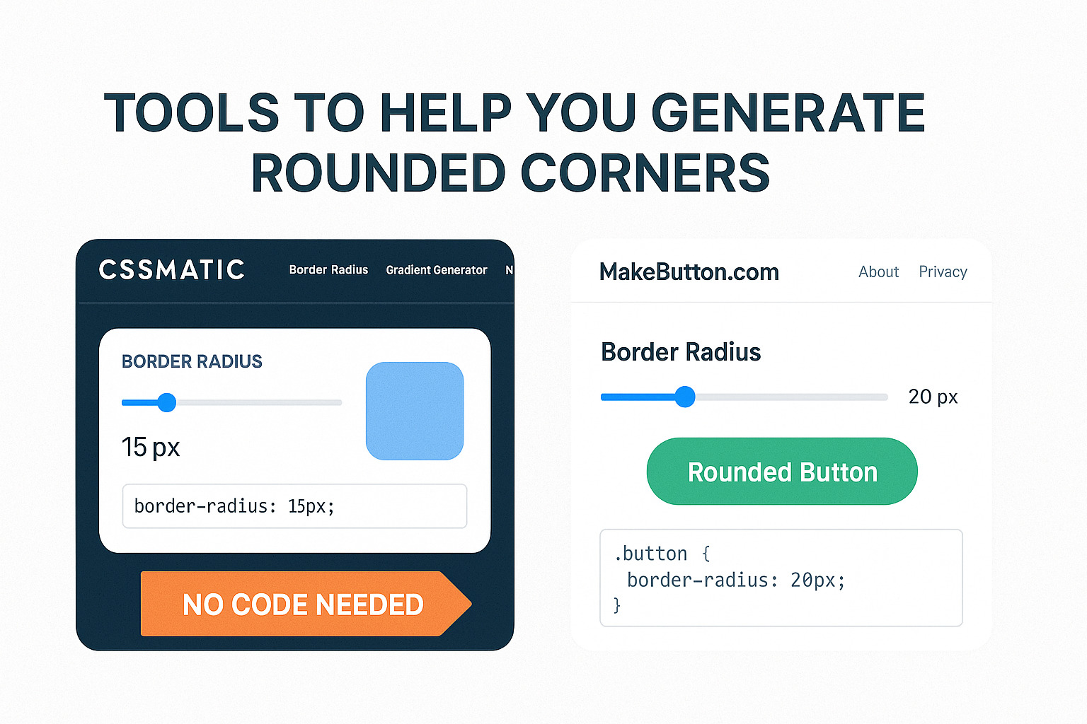
You don’t even have to write code from scratch. Use a free border radius generator like:
UIGradients (combine with borders)
MakeButton.com (great for rounding buttons & previewing styles)
Try This: Rounded Button CTA Generator
Ready to spice up your next landing page?
Use our free generator to create a rounded CTA button in seconds:
Click here to try the tool now
No login. No fluff. Just paste the code where you need it.
Final Word: Small Edge = Big Impact
If you’re in the business of persuasion, details like border corners aren’t just design fluff.
They’re part of the silent language your site speaks.
Rounded corners say:
“This is clean.”
“This is safe.”
“Click me—I won’t bite.”
And your visitors?
They won’t think about it.
They’ll just act.
Bonus: Affiliate Marketer’s Border Pack
Want my full list of high-converting CSS tweaks? Download the free guide here
(It includes rounded corners, hover effects, shadow stacks, and more.)
Let your site feel like it was made by pros—without paying pro prices.