Creating aesthetically pleasing, functional, and responsive designs is paramount in the fast-paced digital world. One of the most essential components of any web interface is the button. Buttons are integral to user interaction for navigation, form submission, or action triggers. A responsive button design tool empowers designers and developers to craft buttons that look great and function seamlessly across devices.
This article explores what makes a responsive button design tool valuable, its features, and how to use it to elevate your web projects.
🎁 Want my Button Profit Kit Cheatsheet?
Discover the exact steps to build high-converting buttons that boost your clicks, sales, and signups — even if you’ve never written a line of code.
👉 Click here to get the free PDF + templates
It’s 100% free — and takes just 60 seconds to set up your first profit button.
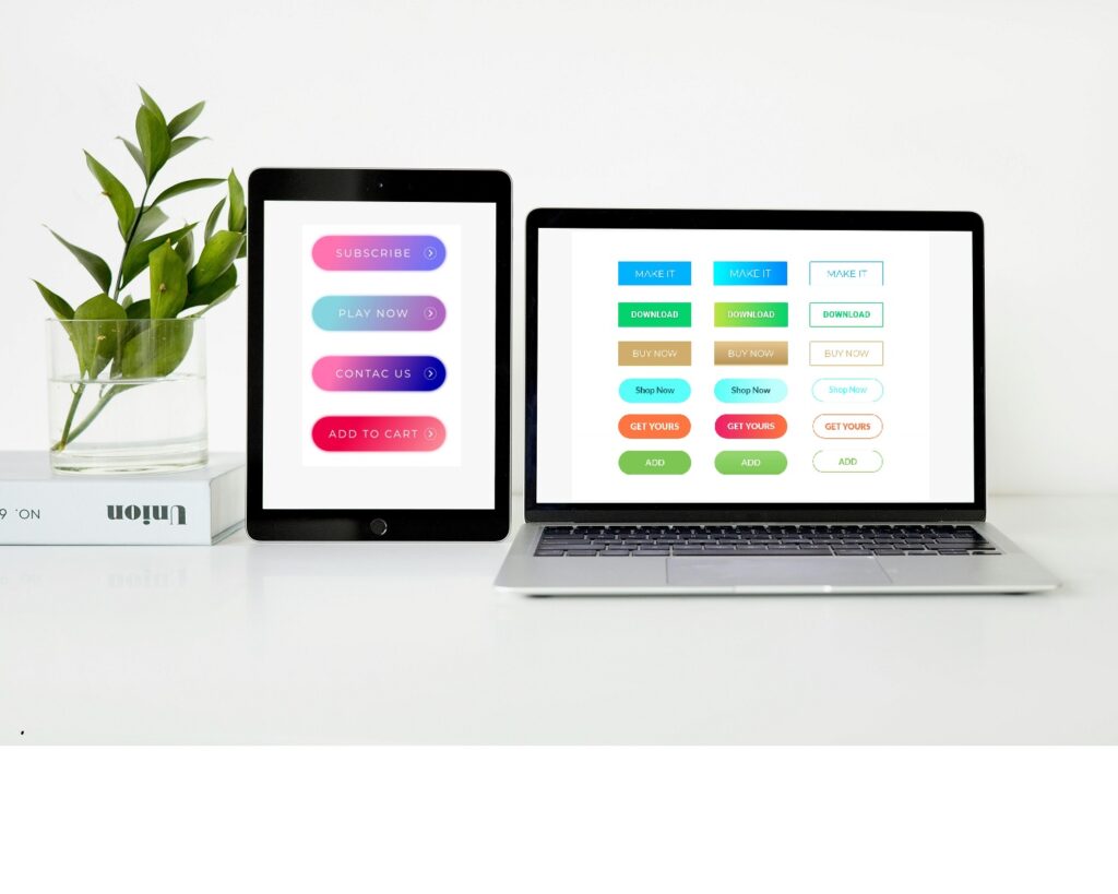
What Is a Responsive Button Design Tool?
A responsive button design tool is a specialized application or software feature that allows designers and developers to create buttons that adapt seamlessly across different screen sizes, devices, and user interactions. These tools are integral to modern web and app design, ensuring buttons remain functional, visually appealing, and user-friendly in various contexts.
Why Are Responsive Buttons Important?
In the digital age, users access websites and applications from many devices, from desktop computers and laptops to tablets and smartphones. Buttons not designed to be responsive can break layouts, hinder navigation, and create a poor user experience. A responsive button adjusts to:
- Screen Sizes: This ensures the button remains appropriately sized and positioned, whether viewed on a smartphone, tablet, or desktop.
- User Inputs: Adapts to different input methods, such as touch, mouse clicks, or keyboard navigation.
- Accessibility Needs: Accommodates users with specific needs by providing precise, functional, and accessible designs.
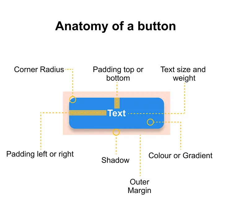
Key Features of Responsive Button Design Tools
- Customizable Dimensions: Automatically adjust button size based on screen dimensions.
- Interactive States: Include hover, active, and focus states to enhance user interaction.
- Flexibility: Allow integration with CSS frameworks or libraries like Bootstrap, Tailwind, or Material Design.
- Testing Capabilities: Provide real-time previews to test button responsiveness across multiple devices.
- Code Export: Generate clean, reusable HTML/CSS or JavaScript code for seamless development.
By using a responsive button design tool, designers can streamline their workflow, reduce development time, and focus on creating intuitive interfaces that delight users. Whether you’re a professional developer or a novice, these tools make crafting responsive buttons more straightforward and more efficient.
Key Features of a Responsive Button Design Tool
- Drag-and-Drop Interface
A user-friendly interface allows you to design buttons effortlessly by dragging and dropping components. You can adjust size, color, font, and shadows without extensive coding knowledge.
- Device Previews
Preview how your button looks and behaves on various devices.
- Customizable Properties
- Color Palettes: Choose from predefined palettes or create your own.
- Typography: Select fonts, sizes, and alignments.
- Shapes: Rounded corners, sharp edges, or custom shapes.
- State Management
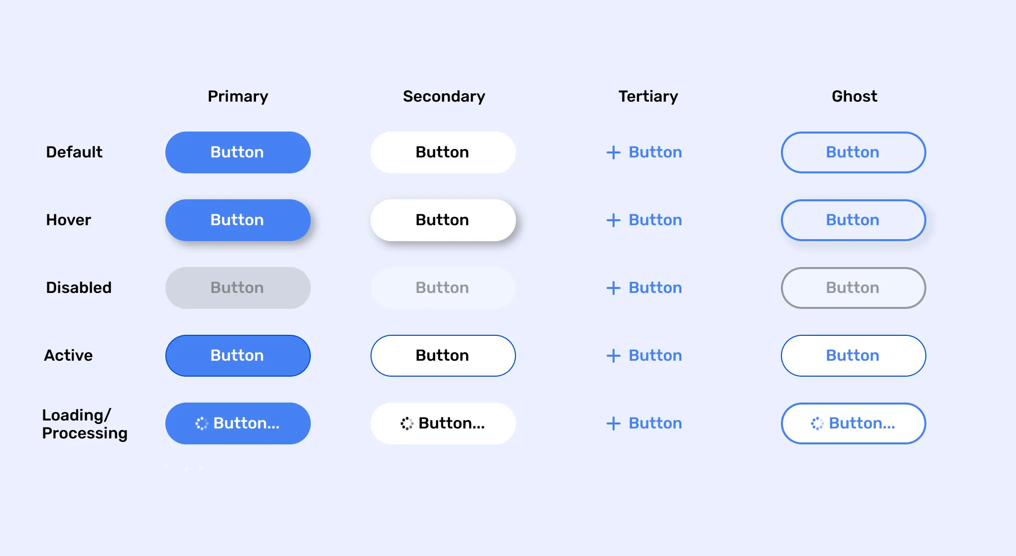
Design for multiple states, including:
- Normal: Default state.
- Hover: Highlighted on mouseover.
- Active: When clicked.
- Disabled: Inactive or unavailable.
- Responsive Breakpoints
Set breakpoints to define button behavior and appearance for different screen widths, ensuring optimal usability.
- Code Export
Generate clean, responsive HTML and CSS code that can be easily integrated into your project.
- Animations and Transitions
Add subtle animations like fades, zooms, or slides for an engaging user experience.
Benefits of Using a Responsive Button Design Tool
- Efficiency
A responsive button design tool can dramatically improve workflow efficiency by automating repetitive tasks. The tool handles these adjustments automatically instead of manually writing complex media queries or adjusting button styles for each screen size. As a result, the overall design process becomes faster and more streamlined. - Consistency
One significant advantage of a responsive design tool is ensuring consistency across devices and platforms. These tools provide a framework that guarantees buttons display uniformly on desktops, tablets, and mobile devices. The tool creates a cohesive design that looks professional and user-friendly across various screen sizes by standardizing button sizes, spacing, and alignment. This consistency fosters a seamless user experience. - Accessibility
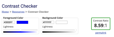
Accessibility is a key component of modern web design, and a responsive button design tool allows you to incorporate essential features that ensure your buttons are usable by everyone, including people with disabilities. These features may include:- Proper contrast ratios: Buttons with high contrast between text and background ensure readability for users with visual impairments.
- Keyboard navigability: A sound design tool ensures that buttons are easily accessible via keyboard shortcuts, which is crucial for users with mobility challenges.
- Aria-label support: Tools that support ARIA (Accessible Rich Internet Applications) labels ensure that screen readers can correctly interpret button functionality, making your site more inclusive.
- Scalability
As your project grows, scalability becomes essential to maintaining a smooth workflow. A responsive button design tool makes it easy to adapt and update your designs to accommodate new features, devices, or design trends. Rather than manually adjusting each instance of a button across your codebase, you can modify the design in one place, and the tool will propagate those changes across the entire system. This scalability ensures that your design remains flexible and can evolve without requiring a complete overhaul each time.
Incorporating a responsive button design tool into your development process offers substantial time savings, ensures a uniform and accessible user experience, and allows long-term scalability. These benefits contribute to a more efficient and adaptable design workflow.
Popular Responsive Button Design Tools
| Tool | Features | Best For |
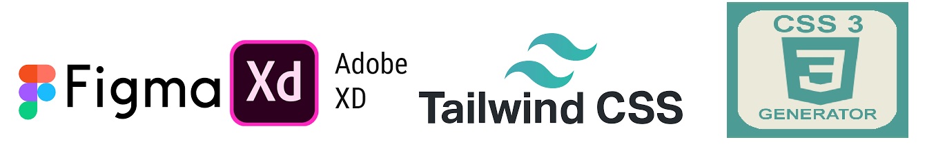
| Figma | Collaborative design, prototyping, and plugin integration. | Designers and teams |
| Adobe XD | Seamless UI/UX design with animation tools and asset libraries. | Advanced interactive designs |
| CSS Button Generator | Quick CSS-only button creation with customizable styles. | Beginners and quick projects |
| Tailwind CSS | Utility-first framework for designing custom buttons with responsive classes. | Developers and coders |
| Button Builder | Drag-and-drop button generator with code export. | Non-coders and small projects |
Steps to Design a Responsive Button
- Define the Purpose
The first step in designing a responsive button is clearly defining its purpose. What action do you want the user to take when they click it? For example, it might be a Call-to-Action (CTA) button like “Buy Now,” “Subscribe,” or “Learn More,” or it could be a functional button such as “Submit,” “Save,” or “Reset.” Understanding the button’s functionality helps determine its design characteristics, including its size, placement, and the urgency of its call. The button’s purpose should be clear enough to prompt user interaction without confusion. - Choose the Tool
Selecting the right responsive button design tool is crucial. Various tools cater to different levels of expertise, from beginner-friendly drag-and-drop editors to more advanced platforms that offer fine-grained control over CSS and HTML. When choosing a tool, consider your project needs, budget, and personal proficiency. Some popular responsive button design tools include Adobe XD, Figma, Sketch, and CSS frameworks like Bootstrap and Materialize. Ensure your chosen tool can quickly adapt your button design for different screen sizes and devices. - Customize Design
Once you’ve chosen your design tool, it’s time to customize the button to match your brand’s aesthetic. Adjust key properties such as:
- Color: Choose colors that align with your branding and ensure they have sufficient contrast to be visible on all backgrounds.
- Size: Make sure the button is big enough to be clickable but not overwhelming. It should stand out but not overpower other elements on the page.
- Typography: Select a legible font representing your brand’s voice on all devices. Make sure the font size is appropriate for both desktop and mobile screens.
- Shape: Round corners or sharp edges? The button’s shape should fit within your design style while ensuring clarity of purpose. Customizing these properties ensures that your button is both functional and visually appealing.
- Add Interactivity
Interactivity is critical to responsive button design, as users expect buttons to react to their actions. Configuring the following states helps create a more engaging user experience:- Hover State: The button should change in some way (e.g., color shift, subtle animation) when the user hovers over it. This indicates that it is clickable.
- Active State: When clicking the button, it should provide feedback, like a pressed effect or slight scaling down to simulate interaction.
- Focus State: For accessibility, ensure the button has an apparent visual focus state (e.g., an outline or color change) to show that it’s selected, especially for keyboard users. Adding these interactive states improves usability and encourages user engagement.
- Test Responsiveness
Testing the button’s responsiveness is one of the most critical steps in the design process. Use your tool’s preview feature to simulate how the button behaves across devices, including smartphones, tablets, and desktops. Ensure the button adjusts size, alignment, and text legibility based on the screen width and resolution. Check for issues like buttons that are too small on mobile devices or are misaligned when resized. Responsive testing ensures that your button provides an optimal user experience no matter the device on which it is viewed. - Export Code
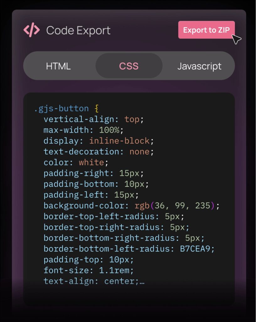 Once you’re satisfied with your responsive button design, the next step is to export the code. Most design tools provide an option to generate clean, ready-to-use HTML/CSS code that can be easily integrated into your website or app. Ensure that the exported code is optimized for performance and cross-browser compatibility. Review the code for any unnecessary elements and test it within the context of your project. Once integrated and functioning as expected, your responsive button is ready for launch!
By following these steps, you can create a responsive button that is visually appealing, functionally adequate, and adaptable across devices. Each step, from defining the button’s purpose to exporting the code.
Tips for Effective Button Design
- Keep It Simple
When it comes to button design, simplicity is key. Overly complex or decorative buttons can distract users from the primary action you want them to take, and they can create confusion. Stick to clean, straightforward designs that communicate the button’s purpose. Focus on using simple shapes, minimalistic text, and straightforward icons. This helps the button maintain its clarity and usability. Avoid unnecessary embellishments like excessive shadows or gradients that make the button cluttered or hard to read. - Focus on Contrast
Contrast is essential in making buttons stand out on a page and ensuring they are noticeable and legible. Choose button colors that contrast nicely with the background to ensure visibility. For example, a bright color like blue or orange on a white or light-colored background can make the button pop, drawing the user’s attention. On darker backgrounds, opt for lighter button colors to maintain the contrast. Remember that buttons should be visually noticeable and quickly identified as clickable elements, guiding users toward taking the desired action. - Use Descriptive Labels
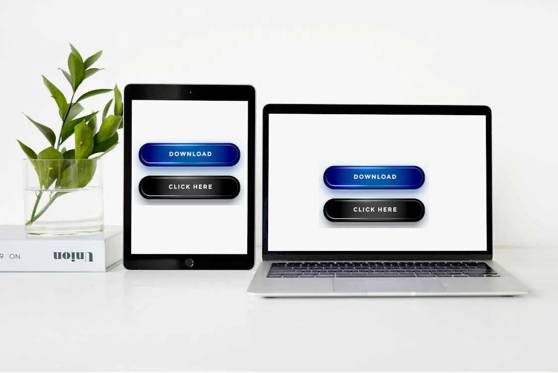
The text on buttons should provide clear and direct instructions to users. Instead of generic terms like “Click Here,” use more action-oriented, descriptive labels that specify what will happen when the button is clicked. For example, “Submit” for forms, “Learn More” for informational pages, and “Add to Cart” for shopping websites. Descriptive labels help users understand exactly what they can expect when interacting with the button, reducing confusion and improving the overall user experience. Keep the text concise but informative to avoid overcrowding the button. - Prioritize Accessibility
 Ensuring your buttons are accessible to all users is crucial, particularly for people with disabilities. Consider incorporating accessibility features such as:
- Larger touch targets: Ensure buttons are big enough to be easily tapped, especially on mobile devices. This can help prevent accidental clicks and make your site easier to navigate.
- Alternative text for screen readers: Provide alternative text for buttons only represented by icons or images.
- Keyboard navigability: Ensure buttons are easy to interact with using keyboard shortcuts, allowing users with mobility impairments to navigate your site efficiently. By prioritizing accessibility, you ensure a wider audience can interact with your design and access its functionality, contributing to an inclusive user experience.
- Test on Real Devices
 While emulators and simulators are great for initial testing, nothing beats testing your button designs on real-world devices. Emulators may not replicate the precise behavior of buttons on different screen sizes, resolutions, or operating systems. Testing on actual smartphones, tablets, and desktops helps you identify any usability issues that might not show up in an emulator. Please pay attention to the button’s responsiveness, visibility, and interaction with touch in322puts across various devices. Real-world testing ensures your buttons perform as expected in the hands of actual users and provides more accurate insights into the user experience.
Following these tips ensures that your button designs are practical, user-friendly, and accessible. Simple, well-contrasted buttons with clear labels will improve usability and help guide users toward the desired actions, creating a smoother and more efficient experience.
Conclusion
Responsive button design tools simplify the creation of visually appealing and functional buttons across devices. You can save time, maintain consistency, and ensure a superior user experience by leveraging these tools. Whether you’re a seasoned developer or a beginner, integrating a responsive button design tool into your workflow is a smart move for modern web design.